Slip: Developing a Grocery MVP from Concept to Prototype
Slip is a recipe-first grocery and food shopping app designed to eliminate the weekly planning burden. From user research through a fully interactive prototype, this student project explored how to make grocery shopping feel effortless, personalized, and trustworthy.
Role
Sole UX Designer
Type
Student Project
Platform
Mobile iOS
Tools
Figma, FigJam
About
Background & Scope
Grocery shopping is a universally shared chore — yet the digital tools meant to simplify it often add friction instead of removing it. Slip was conceived as a student MVP project to reimagine that experience: putting meal planning and recipe discovery at the center of a shopping journey rather than treating them as afterthoughts.
The scope covered the full UX process from competitive analysis and user interviews through persona development, information architecture, wireframing, high-fidelity prototyping, and usability testing — all in a single solo sprint.
Objective
“Design a recipe-first grocery MVP that reduces planning overhead, builds trust through transparency, and keeps shoppers in budget — without adding complexity.”
Deliverables
What Was Produced
Competitive Analysis
User Interviews
Affinity Mapping
Persona
Site Map
User Flow
App Map
Low-Fidelity Wireframes
High-Fidelity Prototype
Usability Testing
Research
Understanding the Landscape
Competitive Analysis
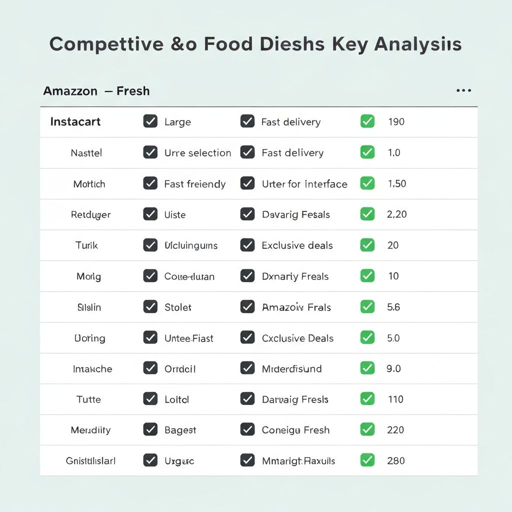
I analyzed four direct competitors — Instacart, Amazon Fresh, Walmart Grocery, and Kroger — evaluating them across convenience, personalization, inventory trust, and recipe integration. Four key insights surfaced:
Convenience
Existing apps prioritize speed but sacrifice discovery — users feel overwhelmed, not empowered.
Personalization
No leading app offered meaningful recipe-to-cart integration based on dietary preferences.
Trust
Substitution handling and out-of-stock messaging consistently frustrated users across competitors.
Opportunity
A curated, recipe-first shopping experience with transparent inventory was a clear white space.
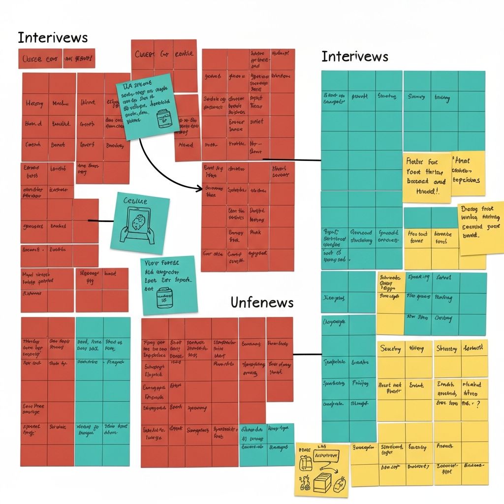
User Interviews
I conducted five moderated user interviews with adults who grocery shop at least once per week — ranging from solo city dwellers to parents managing family meal plans. Key themes from affinity mapping revealed:
- 1
Users want to shop by recipe, not by item — planning meals first drives the shopping list.
- 2
Substitution surprises are a top frustration: users want to approve swaps before checkout.
- 3
Discovery is broken — users default to the same 20 items because browsing feels tedious.
- 4
Budget awareness matters: users want a running total visible at all times while shopping.
- 5
Trust is earned through transparency: clear delivery windows and real-time inventory matter.
Define
Synthesizing into a Persona
Interview themes were mapped into an affinity diagram — clustering findings around planning overhead, substitution anxiety, budget stress, and discovery fatigue. These clusters informed a single primary persona representing Slip's core user segment.
Primary Persona
Christine Young
34 · Working Mother & Project Coordinator · Chicago, IL
"I want to feed my family well without spending my entire Sunday planning and shopping."
Goals
- Quickly plan weekly meals without mental overload
- Shop efficiently with minimal substitution surprises
- Stay on budget without constant manual tracking
- Discover new recipes that fit her family's preferences
Frustrations
- Spending 20+ minutes building a grocery list from scratch each week
- Arriving at checkout and discovering items are out of stock
- No good way to save and reuse favourite shopping lists
- Apps that feel cluttered and hard to navigate with one hand
Design
From Structure to Prototype
Concepting
Site Map
Before touching the UI, I mapped out the full information architecture of Slip. The site map defined the core navigation hierarchy: onboarding, home feed, recipe browser, cart, and account — ensuring every feature had a logical home before a single screen was designed.
User Flow
Mapping the Core Journey
I created a detailed user flow tracing Christine's primary path from app launch through meal selection, cart building, and checkout. This revealed key decision points — particularly around substitution handling and budget visibility — that needed deliberate design solutions.
App Map
Connecting the Screens
The app map visualized how all screens interconnected across the four primary tabs: Home, Browse, Cart, and Profile. This became the north-star reference for developers and ensured design consistency across every state and transition in the prototype.
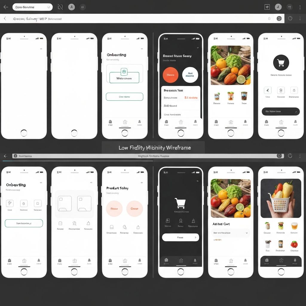
Low-Fidelity Wireframes
Sketching Before Polishing
Starting with low-fidelity wireframes allowed me to iterate quickly on layout and hierarchy without getting attached to visual details. Key screens — home feed, recipe detail, cart, and checkout — were sketched, critiqued, and revised multiple rounds before moving to high fidelity.
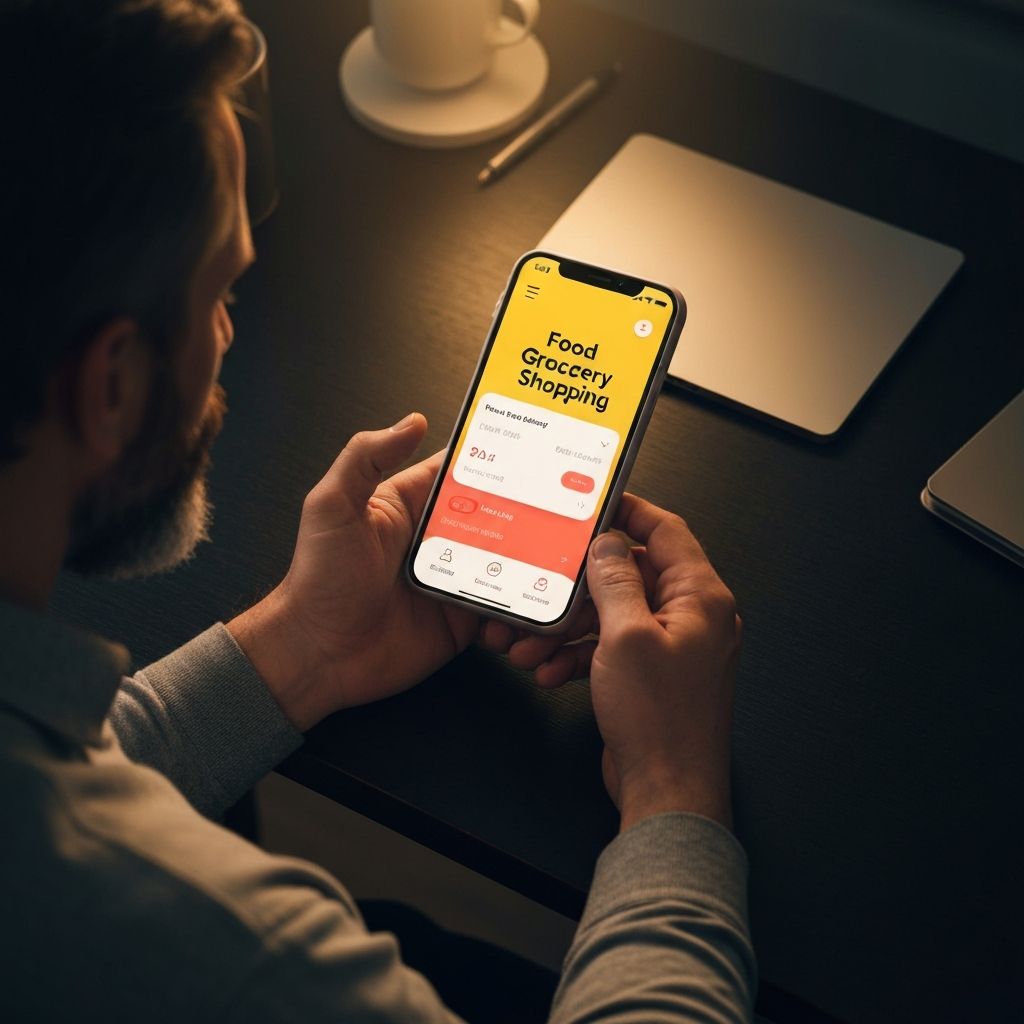
High-Fidelity Prototype
Bringing Slip to Life
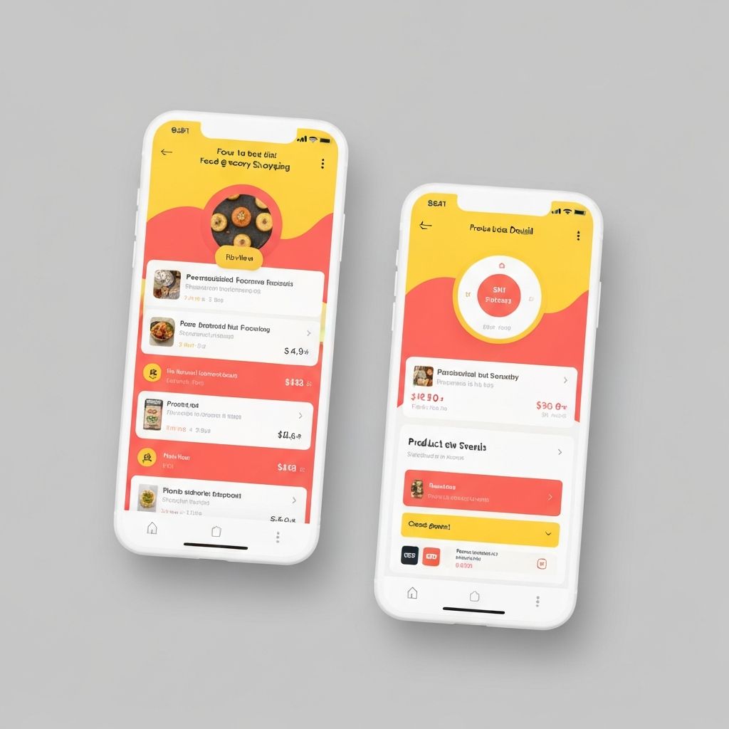
The high-fidelity prototype in Figma applied Slip's brand identity — bold yellow, coral red, and clean white — to a polished, interactive experience. Every micro-interaction, substitution approval modal, and running cart total was designed to reduce friction and build user confidence.
Prototyping
Linking It All Together
Using Figma's advanced prototyping features, I connected all 40+ screens into a fully navigable prototype. Transitions, overlays for substitution alerts, and animated cart updates were all included to give usability test participants as realistic an experience as possible.
Test
Usability Testing & Findings
Usability Survey
Five participants completed a moderated usability test with the high-fidelity prototype, completing three core tasks: adding a recipe to the cart, handling a substitution alert, and completing checkout. Sessions were recorded and synthesized via affinity diagram into five key findings, prioritized by severity.
Substitution flow unclear
criticalUsers did not realize they could reject a swap — the approve/decline CTA needed stronger visual hierarchy.
Running total not prominent enough
criticalParticipants lost track of their budget mid-shop because the total was too small in the cart tab.
Recipe filter discoverability
moderateThree of five users missed the dietary filter on the Browse screen — it needed to move above the fold.
Back navigation confusion
moderateUsers expected a swipe-back gesture on the recipe detail screen that wasn't prototyped.
Favourite icon ambiguity
minorA heart icon was interpreted as "liked by others" rather than "save to my list" by two participants.
Take Aways
Next Steps & Reflections
Next Steps
- 1
Address all critical usability findings and conduct a second round of moderated testing.
- 2
Design the account and saved-lists experience to support repeat shoppers.
- 3
Partner with a grocery API to validate real-time inventory integration feasibility.
- 4
Develop an onboarding flow that captures dietary preferences to power personalized recommendations.
Reflection
This project reinforced that constraints — especially scope constraints on a solo sprint — force prioritization in the most productive way. Every hour spent on low-fidelity iteration saved multiple hours of high-fidelity rework.
The substitution UX problem was the most interesting to solve: it sits at the intersection of trust, control, and time pressure. Getting that one flow right had an outsized impact on how confident participants felt during testing — a reminder that sweating one critical interaction can elevate the entire experience.
Good UX starts with listening, not assumptions.
Slip is a work in progress — but every round of research and testing moves it closer to a product that genuinely earns a place in people's weekly routine.