Redesign of Highland Yoga: Building a Warmer, More Intuitive Digital Experience
A full end-to-end UX redesign of a yoga studio website — from discovery and user interviews through information architecture, design system, wireframes, and a validated high-fidelity prototype.
Role
Sole UX Designer
Type
Student Project
Focus
End-to-End Redesign
Tools
Figma, Maze
A Studio Worth Visiting, a Website That Said Otherwise
Highland Yoga had built a loyal community and a warm in-person experience — but their digital presence told a different story. The existing website was difficult to navigate, buried class information behind multiple clicks, and offered no intuitive path to booking or joining.
The redesign challenge was to translate the studio's authentic warmth and welcoming community feel into a digital experience that was equally approachable — while solving the core usability problems that were creating friction for both new and returning visitors.
Design Principle
“A website should feel like walking through the studio door — warm, clear, and immediately welcoming. Every design decision was held against that standard.”
A Full-Spectrum Design Journey
Discovery & Research
Understanding the Landscape
The project began with an in-depth discovery phase to understand the current state of Highland Yoga's digital presence and the broader competitive landscape. I conducted a heuristic evaluation of the existing site, cataloguing usability issues across navigation, class scheduling, and the booking flow.
A competitive analysis of five comparable yoga studio websites helped surface industry conventions and identify gaps — specifically around how studios communicated class offerings, instructor bios, and membership options. This phase grounded all subsequent decisions in real-world context rather than assumptions.
User Interviews
Listening to Real Practitioners
I planned and conducted user interviews with yoga practitioners of varying experience levels — from beginners exploring their first studio to seasoned practitioners with years of practice. The goal was to understand how people discover, evaluate, and ultimately commit to a yoga studio.
Key themes emerged: users wanted to quickly understand the vibe of a studio before visiting, they valued transparent pricing and flexible scheduling, and they felt frustrated by overly complex booking flows. These insights shaped the personas that anchored the remainder of the design process.
Information Architecture
Structuring for Clarity
With a clear picture of user needs, I focused on restructuring the site's information architecture. A card sorting exercise with participants revealed how they naturally grouped content — separating "classes" from "workshops" was intuitive to users but the existing site merged them, creating confusion.
I mapped out a revised site map and user flows for the three primary user journeys: discovering the studio, browsing and booking a class, and signing up for a membership. Each flow was streamlined to minimize decision fatigue and reduce the number of steps to complete a key task.
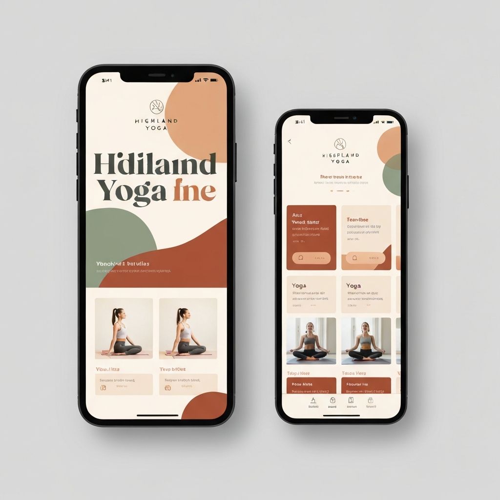
Design System
Building a Visual Language
Before moving into high-fidelity screens, I established a design system that captured Highland Yoga's brand essence — warm, grounded, and welcoming. The color palette drew from earthy, natural tones: a warm cream base, terracotta accents, and sage green for interactive states.
Typography was selected to balance editorial warmth with functional clarity — a serif for headlines and a clean sans-serif for body copy and UI elements. Component definitions for buttons, cards, form inputs, and navigation were documented to ensure consistency across all screens.
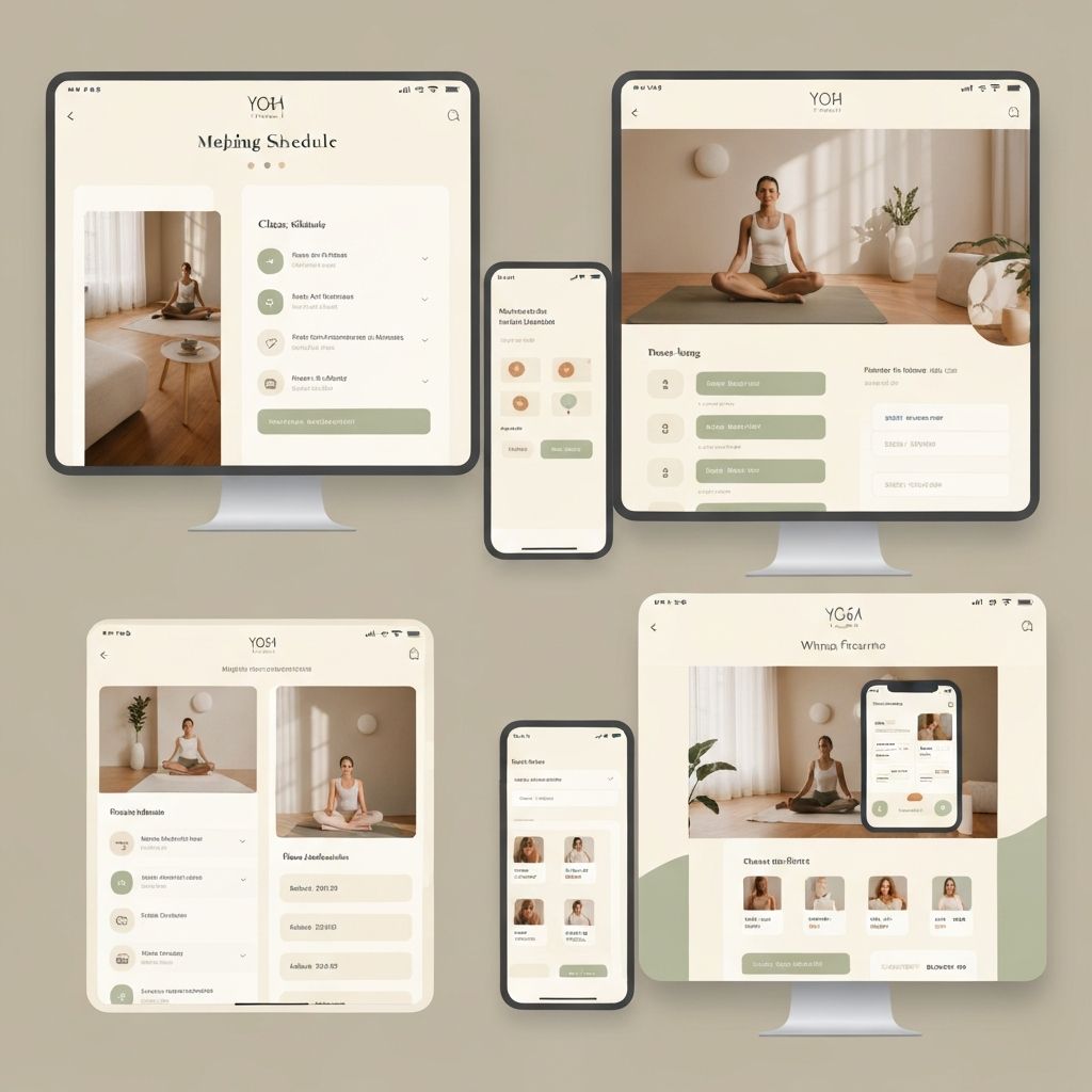
Wireframes & Prototyping
From Structure to Interaction
Low-fidelity wireframes were created for all key pages: the homepage, class schedule, class detail, instructor profiles, pricing/membership, and checkout. After internal critique and iteration, these were elevated to high-fidelity designs in Figma and connected into a clickable prototype.
The prototype covered the two highest-priority flows: booking a single class as a guest and signing up for a monthly membership. Particular attention was paid to the mobile experience, as interview data showed the majority of users discovered and booked classes on their phones.
Usability Testing
Validating the Design
Moderated usability tests were conducted with five participants using the interactive prototype. Participants were given two task scenarios: find and book a beginner yoga class for next Saturday, and compare membership options and start a sign-up. Sessions were recorded and synthesized using affinity mapping.
Key findings included a need to make the class filter more prominent on mobile, and a desire for instructor photos to appear on the class detail page — not just the instructor directory. Both changes were incorporated into the final design iteration.
Highland Yoga Design System
Color Palette
Cream
#F5ECD7
Terracotta
#C2714F
Sage
#7A9E87
Charcoal
#2C2C2C
Typography
Heading
Cormorant Garamond
Elegant, grounded warmth
Body
DM Sans
Clean, readable clarity
Design Principles
- —Warmth before minimalism
- —Mobile-first interactions
- —Reduce friction to book
- —Community over transaction
- —Content earns its space
Outcomes & Impact
3 Rounds
Iterative Testing
The design went through three full rounds of user feedback — heuristic evaluation, prototype testing, and peer critique — ensuring decisions were grounded in real user needs.
End-to-End
Full UX Process
From discovery through high-fidelity prototype, the project demonstrated a complete user-centered design process applied to a real-world business challenge.
Mobile-First
Responsive Design
Interview data confirmed mobile as the primary access point; all designs were built mobile-first then scaled to tablet and desktop breakpoints.
Reduced
Booking Steps
The redesigned booking flow reduced the number of steps to complete a class reservation from seven to three, directly addressing the friction users described in interviews.
Lessons Learned
Research before pixels
Investing time upfront in interviews and competitive analysis prevented costly redesigns later. Every key design decision traced directly back to a user insight.
Information architecture is design
Restructuring the navigation and content hierarchy had a greater impact on usability than visual changes alone — a lesson that shaped how I approach every project since.
Test early, test often
Low-fidelity testing caught structural issues before they were built into high-fidelity screens, saving significant time and producing a much stronger final design.
The bottom line
Great UX is invisible — it just feels right.
The Highland Yoga redesign taught me that the most impactful design work often happens before a single pixel is placed — in the research, the conversations, and the structural decisions that shape everything downstream. Building this project from scratch reinforced my belief that process is what separates good design from great design.