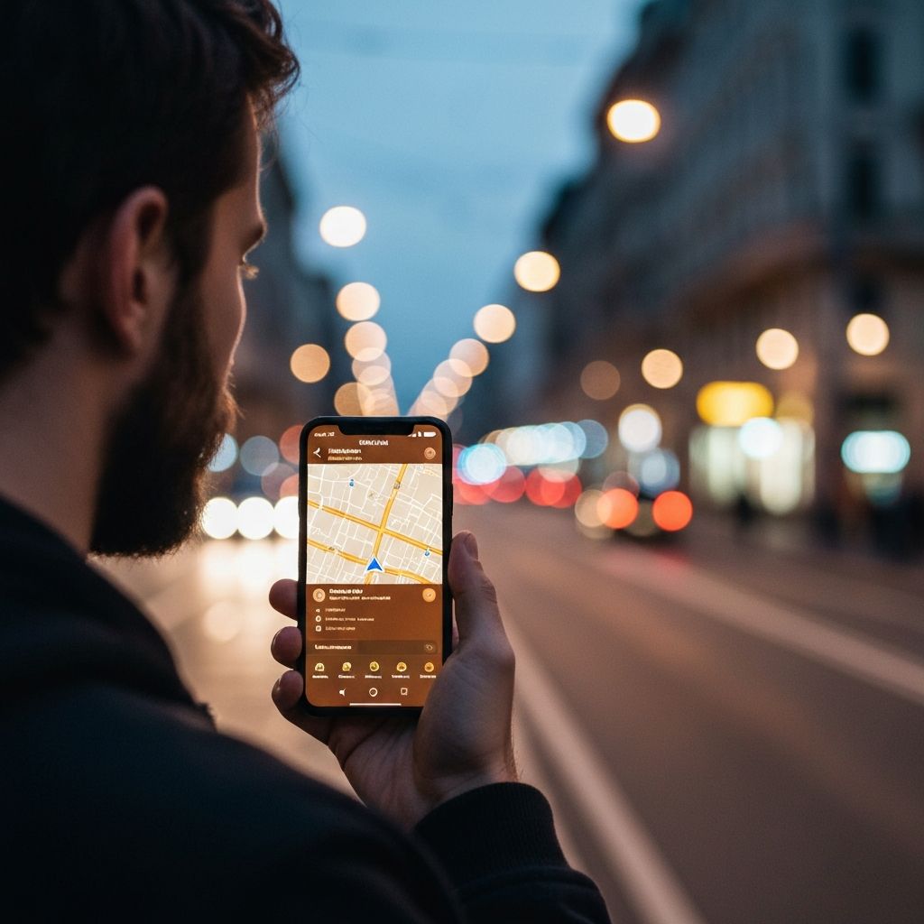
Google Maps: A UX Research Study
An end-to-end UX research project examining how users navigate Google Maps — from competitive benchmarking and user interviews through to persona development, wireframing, high-fidelity prototyping, and usability testing.
Role
UX Researcher & Designer
Team
Solo Project
Timeline
6 Weeks
Tools
Figma, FigJam, Maze
Overview
Google Maps is one of the most widely used navigation apps in the world, yet everyday users encounter friction in core workflows — from multi-stop route planning to saving and sharing locations. This project set out to uncover those pain points through structured research and translate them into actionable design recommendations.
As the sole researcher and designer, I led every phase of the double-diamond process: discovery, definition, ideation, prototyping, and testing. The result is a prioritized set of findings and a revised prototype that reduces friction in the most critical user journeys.
Scope & Goals
- Evaluate the current Google Maps navigation and discovery experience
- Identify usability gaps through competitive analysis and user interviews
- Develop personas to represent key user archetypes
- Design and prototype improvements to the highest-friction flows
- Validate changes through moderated usability testing
What Was Produced
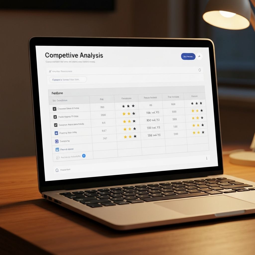
Competitive Analysis
Feature matrix comparing Google Maps against Waze, Apple Maps, and HERE WeGo across 12 criteria.
User Interviews
5 moderated interviews with primary users across commuter and explorer archetypes.
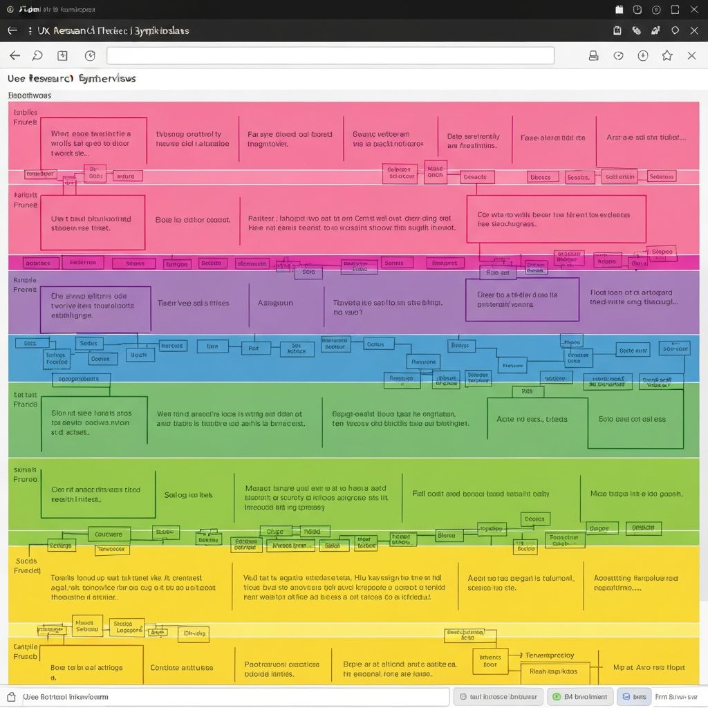
Affinity Map
FigJam synthesis clustering 80+ raw observations into 6 core insight themes.
User Personas
2 detailed personas — Brian (Commuter) and Heather (Explorer) — grounded in research data.
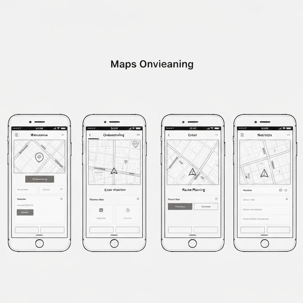
UX Wireframes
Low-fidelity wireframes mapping revised flows for navigation, saving, and sharing.
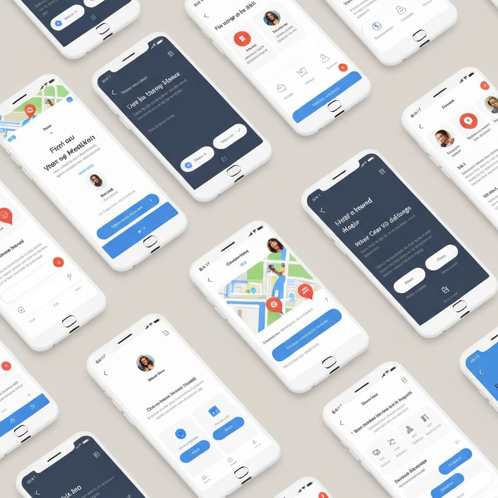
Hi-Fi Prototype
Interactive Figma prototype with 3 revised flows tested with 5 participants via Maze.
Understanding the Landscape
Research began with a competitive analysis to benchmark Google Maps against key rivals, followed by moderated user interviews to surface real-world friction points that data alone cannot reveal.
Competitive Analysis
A feature-by-feature comparison across Google Maps, Waze, Apple Maps, and HERE WeGo highlighted gaps in offline capability, route customization, and social sharing — areas where competitors offered more discoverable pathways.
User Interviews
Five participants were recruited across two archetypes — daily commuters and weekend explorers. Sessions were 45 minutes each, combining think-aloud task walkthroughs with semi-structured interview questions about their navigation habits and frustrations.
5
Participants
45 min
Avg. Session Length
80+
Raw Observations
Synthesizing Insights & Defining Users
Raw observations were clustered into themes using an affinity mapping exercise, revealing six core insight areas. These themes directly shaped the two primary user personas.
User Personas
Brian Moussallem
The Commuter
Age 32
Sales Manager
Goal
Get to meetings on time with minimal friction — needs fast, reliable turn-by-turn navigation without distractions.
Frustration
Cluttered UI makes it hard to quickly glance at next steps while driving. Wants cleaner route summaries.
"I just need it to work. No surprises, no extra taps."
Heather Grenner
The Explorer
Age 27
Freelance Photographer
Goal
Discover new places and save locations for future visits. Loves exploring off-the-beaten-path spots.
Frustration
Saving and organizing places is confusing. Sharing routes with friends requires too many steps.
"I want to feel like the app understands how I explore."
From Sketches to Prototype
Using the personas and insight themes as guardrails, I moved through concepting, wireframing, and high-fidelity design — focusing on the three highest-friction flows identified in research.
Wireframes
Low-fidelity wireframes explored restructured navigation menus, a simplified save flow using bottom-sheet patterns, and a consolidated share button surfaced directly on the active route screen.
High Fidelity Prototype
The high-fidelity prototype maintained Google's Material Design system while introducing targeted improvements: a persistent step indicator on the navigation bar, a redesigned “Saved” tab with guided list creation, and a single-tap route share action.
Key Design Decisions
Persistent Step Indicator
Added a compact "Step X of Y" badge on the nav bar so drivers can glance without leaving the map view.
Progressive List Creation
Replaced the buried "New List" menu with an inline prompt that appears immediately after tapping "Save", reducing steps from 4 to 2.
Surface Share Sooner
Added a share icon directly to the active route banner, removing the need to open the side menu mid-navigation.
Validating with Real Users
A moderated usability study was conducted with 5 participants using the Maze platform. Each session included 3 task scenarios and concluded with a post-task satisfaction survey (SUS score).
5
Participants
3
Task Scenarios
78
SUS Score
6
Findings Surfaced
Usability Findings
Navigation Clarity
High PriorityUsers struggled to identify their current step in multi-stop routes without scrolling through the full list.
Save & Organize
High PriorityThe process for creating and naming custom lists was not discoverable — 4 of 5 participants failed on first attempt.
Share a Route
Medium PrioritySharing a live route required navigating three separate menus. Users expected a single tap from the active navigation screen.
Offline Mode
Medium PriorityUsers were unaware offline maps existed as a feature. Zero participants found it without prompting.
Search Filters
Low PriorityFilter options for category searches (restaurants, gas stations) were underutilized — labels were not descriptive enough.
Accessibility
Low PriorityFont size within route details was too small for users 45+ without pinch zoom. No visible accessibility settings entry point.
Affinity Diagram — Post-Test Synthesis
Post-test observations were clustered into a second affinity diagram, grouping usability issues by theme. This synthesis validated the original research findings and surfaced two previously unidentified friction points around offline mode discoverability and accessibility.
Reflections & Next Steps
What I Learned
This project reinforced how even the most polished, widely-used products carry hidden friction. The competitive analysis revealed that Google Maps' strength in accuracy comes at the cost of discoverability — features exist, but users simply cannot find them.
Conducting moderated sessions also highlighted the value of think-aloud protocols. Several insights — particularly around the offline maps feature — only surfaced when participants verbalized their mental models rather than simply completing tasks.
If I were to continue this project, I would prioritize accessibility testing with participants aged 50+ and explore the potential of AI-assisted route suggestions as a differentiator in the redesign.
Next Steps
- 01
Conduct a second round of usability testing with revised prototypes incorporating navigation clarity improvements.
- 02
Partner with the accessibility team to evaluate WCAG compliance gaps identified during testing.
- 03
Present findings to stakeholders with prioritized recommendations mapped to development effort.
- 04
Explore a mobile-first redesign of the "Save" flow using progressive disclosure to reduce cognitive load.
The bottom line
Good design is invisible. Bad UX is a wrong turn you feel immediately.
By grounding every decision in research and keeping users at the center of the process, this project demonstrates how incremental, validated improvements — not wholesale redesigns — are often the most effective path to a better experience.